20 best minimalistic packaging designs
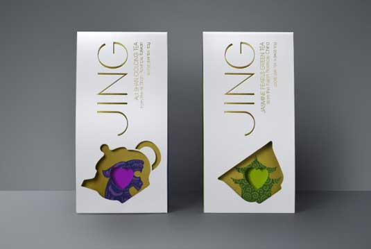
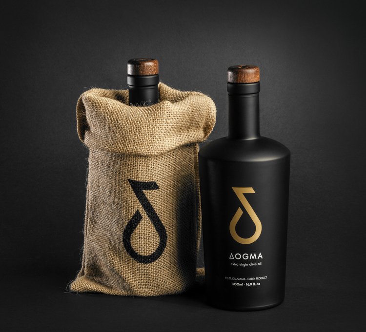
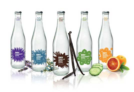
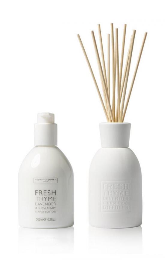
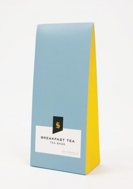
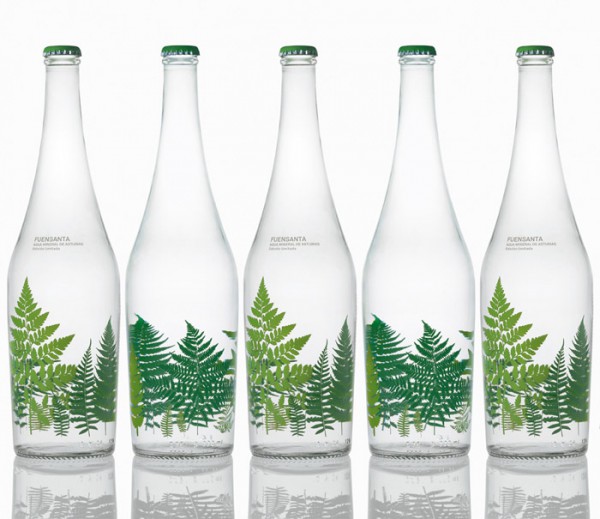
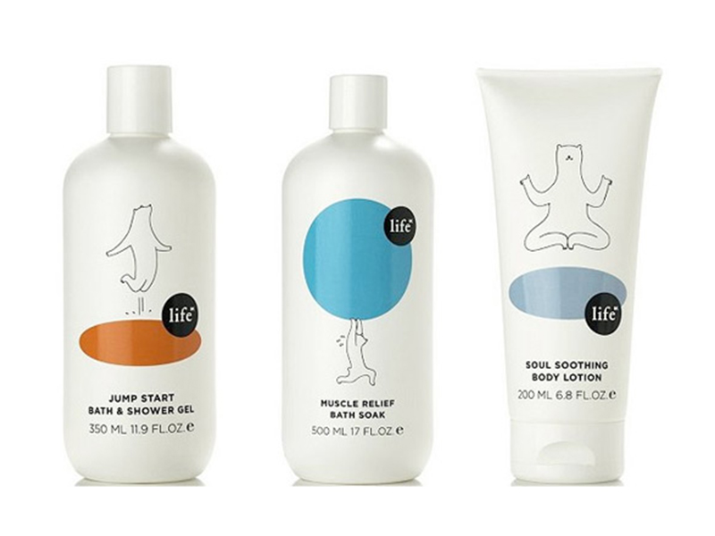
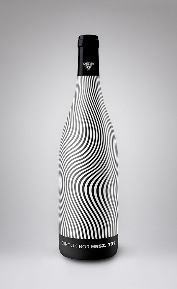
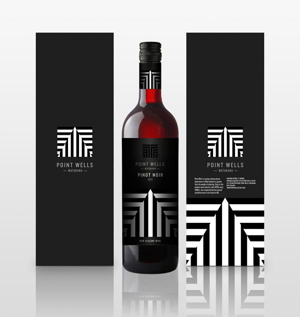
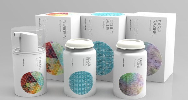
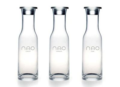
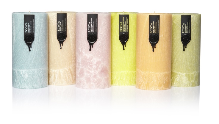
As we always say “less is more…” This has become of a rule to live by in today’s society. Talking about packaging designs, sometimes a design can be relatively simple but still stand out from the rest. Yes, we think that simple, understated design can be more effective in communicating a message to the consumer, making their decision-making process of which product to purchase much easier. Minimal packaging can portray elegance and refinement, purity and simplicity. They truly allow the products to shine and take center stage.
It is a noticeable trend among consumers who looks for clutter-free packaging, no-fuss marketing, over which product is the shiniest, and which has the most colorful label. We suggest using minimalistic packaging design to evoke core feelings of your buyers.
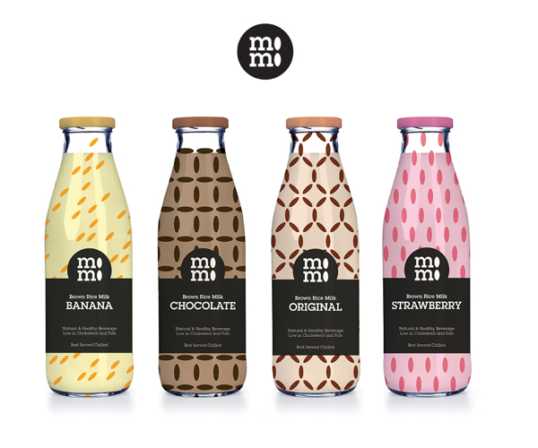
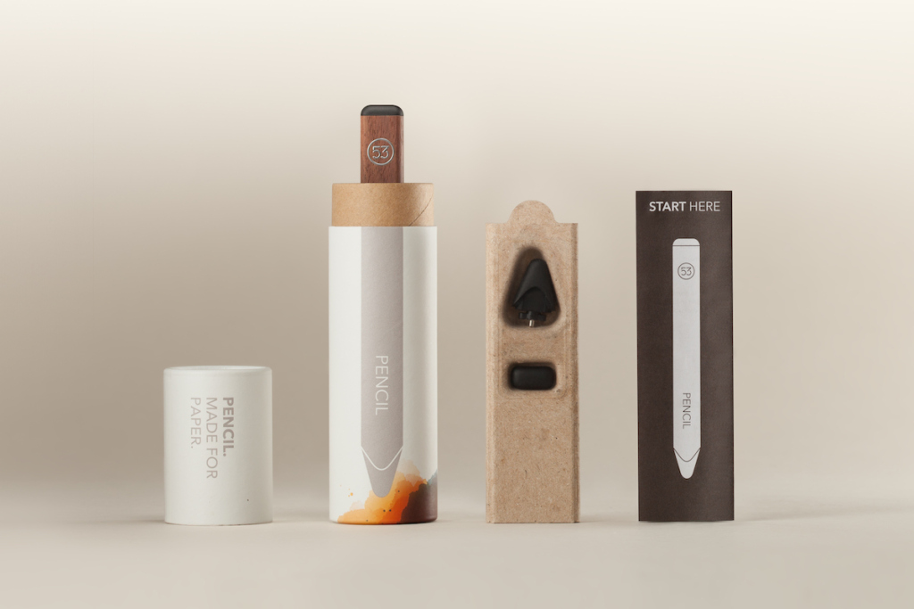
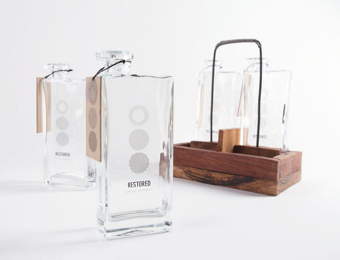
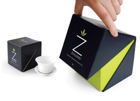
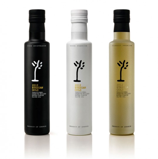
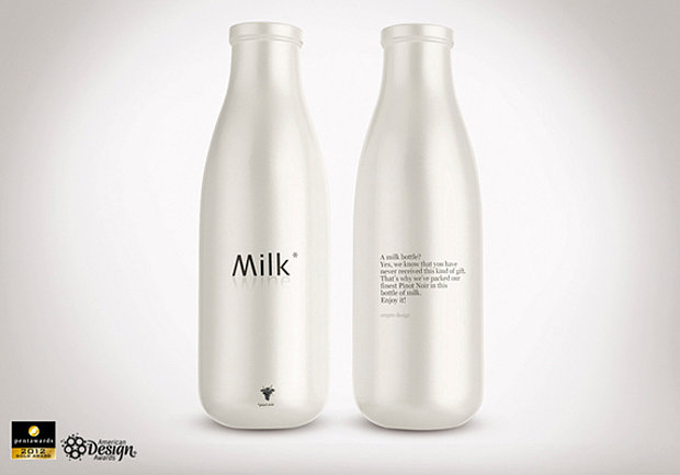
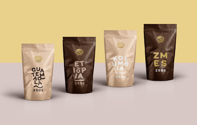
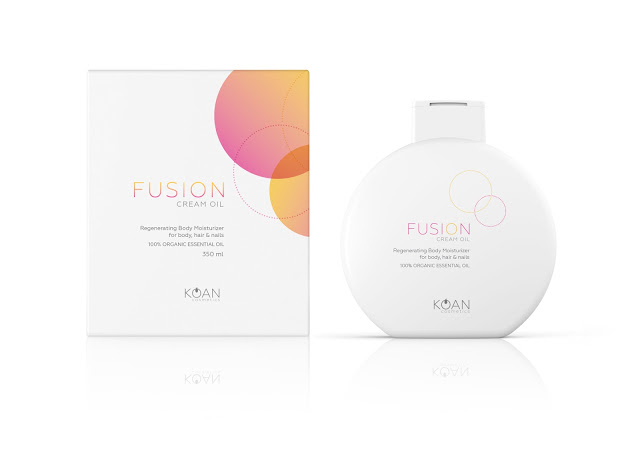
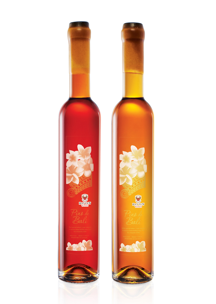
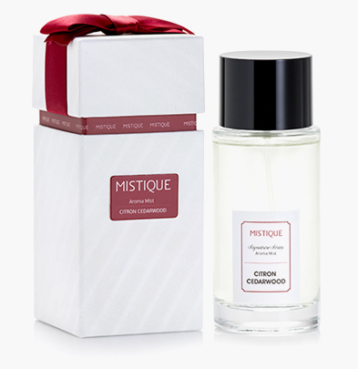
We have compiled a list of 20 best minimalistic packaging designs you’ll want to buy – even if it is just for the packaging. Simple designs can be the most effective, as these brilliant examples of minimal packaging design show.
And here are some of the minimalistic packaging designs that our team at OVOC have come up with:
IT’S YOUR TURN
What do you think of this article? Share your experience and insights in the comment box below.
Sign up for our free newsletter by entering your email address and name below to keep updated plus receive our free report “Top 5 tips for successful internet marketing that help supercharge your profits”. Yes, all these for FREE!



 Award-winning logo design, graphic designer, web design, internet marketing consultant and online reputation management from Singapore.


